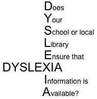
 What does your library and dyslexia have in common? They both have a lot to do with reading. So if your library does not have information about dyslexia or dyslexia friendly books such as this one, then tell the librarian or a teacher or the head!
Dyslexia Friendly Books
The Compromise!
‘The Sword of Davalon’ by Tom Jolleys is the first book published by The Kids (Keeping Informed of Dyslexia Services) Press.
The layout of this book has been specially designed to make it Dyslexia Friendly. However, this does NOT mean that every dyslexic child or adult will be able to read it with ease. The book comes from a manuscript that was written over twenty years ago. We have adapted it and made it ‘easier’ to read.
The book is actually for all children in roughly the age range of 8 to 12. In fact the layout should make The Sword of Davalon easier to read for all children including those with poor eyesight, and we hope to improve the layout in future editions as we receive more feedback. Very simply, what we have tried to do is make the printed word just easier to see and therefore read. This layout may not be beneficial for everyone, but in the main, the print in this book should be easier to read than many other books of a similar length. We will also do the same with the sequel, ‘The Trek of the Rainbow warriors’, so any comments will be most welcome.
We could have gone even further in making this book Dyslexia Friendly, but then we would be drastically altering the appearance of the printed page, and we feel that this would be wrong for this particular book. There is a certain stigma surrounding dyslexia, so we are trying to keep this book like most other books, and a book that many dyslexic children will feel comfortable with, especially for example when taking a novel into school. We are trying to achieve a compromise. So this is what we have done:
1: An Arial font which is a sans serif font. It is generally recognised that a sans serif font i.e. a font without the little platforms, is easier to read for dyslexics. This sentence is in Times New Roman – a serif font. If you look closely then you will notice the ‘platforms’. Back to Arial. It would be a great help to us at The Kids Press if you would write to us/email us regarding your favourite font for reading or your child’s favourite font. Research is ongoing with dyslexia, and we want to get it right. Some children with dyslexia may indeed prefer a serif font – if so then please let us know. Most children’s books are printed in a serif font although sans serif is becoming more popular.
2: A 12-point font size. This is larger than most books of this length. We think this will be beneficial for anyone with dyslexia and definitely better for many children with poor eyesight. The larger font means less words on the page and should make words easier to see and therefore read. Please contact us if you have any preference for size of font. Most similar books use a font size of 11 or 11.5.
3: An 18-point leading (line-spacing, although future editions and other books in the series may have a 17-point leading). This is the distance between lines. We use a very large line spacing which should make reading easier for everyone, but especially dyslexic children. This is because it creates more space around each word.
This is double line spacing. Publishers tend to prefer author’s manuscripts with this spacing. It should make each line easier to read.
In the next few lines the font is smaller and the line spacing has been reduced. The print should be a lot more difficult to read because the words tend to merge into each other. In a way, this is just one of the problems faced by children with dyslexia.
This is a script type of font – I find it very difficult to read, but I do have very poor eyesight. Most dyslexic children would struggle with this type of font.
Back to Arial. We hope that with our size of font and line spacing, the lines do not ‘merge’ into each other as they well might do for dyslexics. Not only that, but a larger line spacing makes it easier for the eye to go from the end of one line to the beginning of the next line which can be a problem with dyslexia. Some dyslexic sites will recommend a ragged or unjustified right-hand margin – absolutely nothing wrong with that at all, and we recommend that you seriously look at Dyslexia Action and The British Dyslexia Association websites for advice because we believe that they are the experts in the field of dyslexia. However in this particular case, we think that this would dramatically alter the appearance of the page, and we think that a larger line spacing solves this problem whilst retaining the appearance of nearly all other books. We are trying to achieve a degree of balance.
4: We use a cream paper which is generally recognised to be beneficial for children with dyslexia. Apparently a bright white paper can be too bright. Again please contact us if you agree or disagree. Other colours can also be beneficial but again we are trying to make our books appear just like any other book. We have looked at various papers – different colours, thickness and weight, and again we have struck a balance using a Munken Cream 80 gsm paper with a high volume. A heavier paper could be even better because the aim is to stop any print coming ‘through’ the paper, but then using a heavier paper means more expensive paper and this results in increased postage charges.
5: No underlinings. Originally there were many underlinings in The Sword Of Davalon, but these have been removed because underlinings can cause confusion. They can get in the way of the words, but we would like your comments.
6: No italics. Italics can be used to great effect on the printed page, but they can be difficult to read, just as handwriting can be difficult to read, so none are used in The Sword Of Davalon.
7: Few all upper case words. Some are used in The Sword Of Davalon, mainly for emphasis. They can also be very effective for headings, however we have tried to limit their use.
8: More commas to split up longer sentences. When The Sword Of Davalon was first written, approximately 1984/5, it was written in the manner of nearly all other books and was not specifically written for children with dyslexia. That is why the book is for all children. However, with dyslexics in mind, I have added more commas to split up certain sentences. Dyslexic children prefer shorter sentences so I am hoping that by splitting up the sentences further with more commas then hopefully I am making it more Dyslexia Friendly.
9: We have replaced semi-colons with hyphens. This is another way of splitting up longer sentences, and the hyphen gives a much more visual division than a semi-colon.
So as you can see, by relatively simple measures we have attempted to make our books Dyslexia Friendly.
Dyslexia – good or bad!
Just a few words to say about the stigma that surrounds dyslexia. Some parents view dyslexia as a handicap whereas some view dyslexia as a ‘gift’. I suppose it depends on your outlook on life. At The Kids Press we try to give a positive outlook. But whatever you think there is little doubt that seeking out professional help is the best step forward, especially if you can have a private tutor and especially one to one. If not provided by local authority funding then it can be expensive at £20 and upwards per hour, although you may be able to get half-hour lessons. My wife, Rowena, is a dyslexia consultant who teaches part-time mainly on a one to one basis with her pupils, and she has achieved some extremely encouraging results. Her pupils have shown great progress at school. Some people may say that they have a quick fix cure to dyslexia – and fair enough, everyone has their own view, but we think that conquering dyslexia is a long-term job with a lot of hard work. What we have tried to do as said before is produce children’s books that are for all children but are designed to be Dyslexia Friendly.
There is one main point about these books and that is that the actual writing of the story has not been altered to make them ‘easy’ to read – but the layout should make them ‘easier’ to read. Some dyslexic sites will say that to make a book Dyslexia Friendly the content, the words, should be simple, and the sentences short, – quite correct. However we give you the choice – a book that looks like a book – a book that has a great story (this is so important in any type of novel), and a book that we are proud to say is Dyslexia Friendly!
What does your library and dyslexia have in common? They both have a lot to do with reading. So if your library does not have information about dyslexia or dyslexia friendly books such as this one, then tell the librarian or a teacher or the head!
Please remember that children with dyslexia may still struggle to read this book. Dyslexia friendly means that the layout should make it ‘easier’ to read. It is always advisable to seek out specialist help.
So The Sword of Davalon may indeed be too difficult for yourself or your child to read, but there is nothing wrong with reading the book with your child, and the main point about our books is that if we can do it then other publishers can produce Dyslexia Friendly Books. Hopefully it will be just the start of a great change in book publishing!